Thursday 29 September 2011

Works Produced by my Classmates

Examples of work produced by my classmates that I find interesting in terms of their styles, methods, compositions and final works:

I like the idea of an image superimposed on text. The text is printed in reverse. I do not know if this was accidental or on purpose but that is one of the reasons I find it fascinating. Maybe there is a secret message that is being hidden? It reminds me on one level of the writings of de Vinci. Also the colour choice here reminds me of doodles in blue biro. At first glance, a secret message written by hand?!


I think the graphic and simplistic nature of this image works very well for lino printing. Also the yellow on black contrasts well.


Great detail and intricate work done on this lino print. I love looking at the contrast between the black and white and the coloured version. I love the evident perspective in the black and white version but I think the colour choices are unexpected and work well. Its very interesting to see how colour can have such a huge influence on an image.


Another great example of how colour can influence images. However I think the actual lino cutting process is the most interesting aspect of these images. The lines in the cut pieces of the lino, especially in the green and black version have a lovely textural feel and for me, add a sense of an indistinguishable background. These marks have a rhythm which work with the stylised imagery.


I like the composition and use of negative space in these pieces. Printing on linen also adds a new dimension to the image especially when done in such a light colour. It results in a more dreamlike, softer image than the stark, graphic, hard lined image represented by the black print.


An example of cardboard printing. A great alternative to printing in schools when there is no printing press or an interesting project to use recycled cardboard?!


Wednesday 28 September 2011

Etching 2

Etching Incorporating Text:
I returned to the tree motif in this etching but began to experiment further with creating text which would be legible.
  • Using the tracing paper method as outlined previously, I marked out my image on the photographic paper using a soft tipped marker.
  • I carefully scribed my text by referring to the tracing regularly.
  • I also wanted to experiment more with the idea of new techniques and so I decided to use cutting out significant portions of the piece.


The Final Piece:
I quiet like the framing effect achieved and with the text I feel this piece feels almost illustrative in nature whilst still being true to a true representation of a tree.  One of the most surprising results of this etch was the print left on the newsprint during the printing. I love the effect left behind. It reminds me of a shadow or a reflection or a ghost like imprint left behind by the process.


Lino Printing 2

2 Colour Lino Print:

  • The registration markings are of vital importance when printing more than one colour.
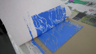
  • When using several colours the print is made up of several paint layers. The shapes/composition is determined using the reduction method, with the lightest colours tending to be printed first and the darkest colours being printed last. 


First layer print


The Final Print:
With this print I decided to embrace the medium of the print making process and to not be as exacting as I was with my first print. After looking at some others work I saw that how the markings left by the lino cutting tools can add a new dimension to the piece, as opposed to my first piece where I was very particular about keeping the edges clean and sharp. I tried to use the craft knife as little as possible. Also the direction in which I cut the lino was done very purposefully as I wanted it to represent water and movement.


Tuesday 27 September 2011

Activity in the Classroom

I have really being enjoying the buzz and studio feel. In such a short time I think there has been a lot of creativity and inventiveness and I have been so inspired by the general vibe and atmosphere. This printing block has given me an opportunity to investigate an area I really only briefly touched on in my undergraduate degree. Really looking forward to what the rest of the year has in store for us all!


Etching 1

Inspiration for this Piece:
I began by looking at flowing water and the photographs I have taken on Castleconnell riverbank. I find the disturbed flowing of the water by the rocks and mini waterfalls very interesting visually and I wanted to capture the movement and textures in these scenes.


The Process of Etching on Photographic Paper:


  • I began by outlining in a soft marker, as it does not mark or indent the paper, the composition for this piece.
  • Using a darning needle with a good sharp point and a craft knife I begin to draw or more correctly etch the image into the paper.
  • I experimented with my tools to create different markings, in order to represent the various textures I was attempting to convey. I used long, almost painterly strokes with my craft knife to represent the flowing water and more scratchy, rough markings using both the needle and knife for the riverbank.
  • Cutting out pieces of the paper also created different textures which I hope will create an interesting visual image.

  • When the etch is complete the paper and the etching itself must be prepared.
  • The cartridge paper, which is better for etching because it is most fibrous and thicker is soaked in a basin of water before being left to dry for an hour in between sheet of newsprint.
  • The paper must be still slightly damp but not wet for etching.

  • Oil paint mixed with linseed oil is used for etching. Using a palette knife the paint is mixed the the correct liquidity.
  • Rolled cotton wrapped in black tape as a tool to apply the paint to the etching is a simple and cost effective home made tool.


  • The entire etch is covered in paint, taking care to really work the paint into all the groves and markings.
  • Using severally times folded newspaper to wipe the etching with the flat edge of the paper, remove as much paint as possible.


  • Place a piece of newsprint on the bed of the printer, followed by the etching, facing up and as close to the roller as possible, followed by the slightly damp cartridge paper and finally with another layer of newsprint for protection of the press.
  • Roll the print through once. Do not re roll as this may slightly move the paper or print and cause some disruption of the image.
  • Carefully remove the printed image and leave to dry between newsprint with some light weight on top so as to stop warping of the paper.
  • Clean the photographic paper carefully with white spirits and a soft cotton lint free cloth.

The Final Print:
I really enjoyed experimenting with the markings, colours and the different effects I have achieved. I really enjoy drawing as a medium and I feel that etching was a very natural progression for me.


Lino Printing 1

Inspiration for this piece:
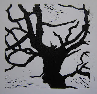
I took this photograph on a particularly cold and bright winter morning. I really like the silhouette of the branches against the sky. I reduced the image to black and white to emphasise the linear qualities of the tree shapes and to create a more graphic image which I thought would be a good place to start with making a mono lino print.  


The Process of Lino Printing:


  • Prepare the lino for cutting by glueing it securely and on the left hand side of a large piece of cardboard.
  • Carefully measure registration markings by using the straight edge and corner the paper size you will be using. Create these registration markings by glueing pieces of lighter cardboard or card to the piece, as illustrated above.


  • These are basic lino cutting tools widely available in art and craft supply stores.
  • I also like to use a craft knife for detailed work or for when I want to keep edges sharp and clean.  


  • By attempting to keep this image as graphic and clean as possible I had to sacrifice some detail. The medium of lino was not suitable for a all of the detail contained within the original photo, so I kept the strongest components of the image whilst keeping the shapes of the print detailed as possible. 


  • The water based printing paint needs to be mixed with a palette knife on glass. A little water may be used if the paint begins to get too dry, however the paint must remain tacky and not runny.


  • The paint, when of the correct consistency and colour, is rolled out using a printers roller.


  • Placing a piece of paper over the print and cardboard backing, with a hole cut out for the print is advisable as this will stop the cardboard getting covered in paint and marking the finished prints, as demonstrated above.
  • The paint is applied on the lino print in an even fashion, covering all raised pieces of lino evenly.
  • Remove the paper, leaving only the print inked up.
  • Carefully place the paper onto the print, using the registration markings as guides. 
  • Rub the paper onto the inked up lino. Use a wooden spoon to apply pressure evenly all over. This will ensure as much of the paint is transferred to the paper as possible.
  • Remove carefully and place on a drying rack.


The Final Print:
I experimented with a couple of colours but I think the black on white paper looks the best. I am pleased with the crispness of the lines and the overall shapes achieved. Initially I did not want the lino markings in the white areas and was considering removing them further and re printing, but now I actually quite like the visual effect it achieves. I think the interesting contrast with the crisp black lines and white paper and how it reminds us of the actual technique. Without these imperfections the image might just look like a cut-out or stencil.


Artist Research

I have begun my initial research into the medium of print by looking at some artists who are currently working in the field of print, or whose style of painting combines visual elements applicable to printmaking.
I have also started looking at some artists whose subject matter interests me in terms of my own practice.


I like the visual complexity of Michael Landy's work. His materials of oil stick on paper adds a simplicity to the production of the piece. His seemingly chaotic arrangement of objects, and the approach of only depicting the positive and negative space in this image is striking. I especially like the strong contrast of black and white.
Michael Landy "H.2.N.Y. Non-Performance", Oil stick on paper, 2007


This is an excellent example of etching. It is a highly detailed piece which displays several methods of print. This piece is relevant to me because of the subject matter. I hope to produce work based on views of a riverbank and this is a great example of the types of effects achievable through the method of etching.
William Kendridge "Reeds", Etching, aquatint, drypoint, hand-painted paper with further hand work in red/white pastel, 1996


This painting of a flowing river is relevant to my chosen subject matter. The stylised imagery, perspective and the muted tones used could be interpreted in print.
Anthony Whishaw "Downstream Thaw" 2008


Walker's use of nature motifs, plants and trees etc, in her work are striking. The contrast of her flat, black cut-outs and colourful light installations, take both methods to a new, exciting and eclectic place. I find the stylistic approach to natural forms and the use of black very interesting.
Kara Walker "Darkytown Rebellion", Cut paper and projection on wall, 2001


Whilst researching lino printing I came across the work Friedo Howling. She uses this printing method to create strong, land-scape based images. I particularly like the way the process of lino cutting itself is evident in the work. There is no attempt to disguise the slight imperfections in the preparation and printing, this slight "roughness", adds weight and substance to the image.

Frieda Howling "Sculpture in Nature", lino print

Monday 26 September 2011

Subject Matter Research

These are a selection of some photographs I took along the riverbank, near the footbridge in Castleconnell, Co. Limerick. I actually took these photos last year on a particularly bright and fresh morning last winter. The area is one of particular natural beauty. There is a small river flowing over mini waterfalls and stepping-stone walkways. This gives the river, even though narrow, great movement and visually very interesting textures and varying water surfaces. I really like the way the tree on its own is striking against the clear, light blue sky. The silhouettes of the bare and rigid tree branches contrast greatly with the fluidity of the water in the lower left hand photo. I hope to do some works based on the waters movement and the tree and branch silhouettes. 


I have started to look at these images tonally by removing colour from the equation via photocopying. I want to look at basic shapes and outlines, tones and shades. 

Some preliminary sketchbook drawings looking at composition ideas for future work.